
Thursday, September 30, 2010
Sign
Friday, September 24, 2010

Obviously I was not very original but I did decide that instead to make the "paint" (spots) not necessarily on the bottom because I'm giving it a opposite look as though the word "splat" was hit by a paint ball and some of the paint came off the words instead of the paint on the bottom splatting onto the word.
Tuesday, September 14, 2010
My Glyph picture.

I chose to do a person at the disco. The white letters are the flashy suit and I decided to give him personality by giving him a cane, a belt, and a top hat. I also thought it set the picture by having a disco ball and and the lights coming off of it in the background. He is made of all Comic Sans and is a lot of fun.
Friday, September 10, 2010
My Quote
I decided to make each word a different size or font to emphasize the meaning of each word. Since silence is the main idea I decided to give it depth and meaning while the other words led up to the reason of the quote which is the word... words. I decided to make the words colorful because its a broad meaning. And could mean alot of different things to different people. Also I felt like making it as simple and plain was the best way to portray the meaning
To add on to the last post, in this quote the word "words" are emphasized to show the importance of that particular word. Also it has alternation rhythm like the different sizes of words and the different colors and type style.

Friday, September 3, 2010
Pictures
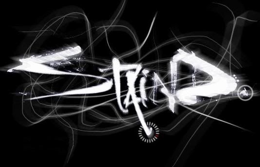
This picture describes chaos. No line is the same size as well as no line is going in the same direction. Some letters are thick and some are thin. Also the amount black to white ratio is a lot. This album was about a lot of problems and sorrow which was a way to portray their name
This picture has alternation and emphasis because for alternation nothing is the same in this picture. they are all different size lines. And emphasis the actual word is brighter than everything else which brings out the name of the band more.

There is many round things in this picture and square. Which is honesty stability which portrays Spongebob in many ways. This picture is also very bright and personal to show the personality of Spongebob.
This picture is Symetrical. If you split spongebob down the middle you will get the same thing down the middle.

This picture shows real texture. Because this is what it really looks like for a windshield to look like if it were to get hit by a softball.

Its a Show
This close up of this man is dealing with size. The effect of it is for the person looking at this picture can truly feel what they mean when it say "The truth is written all over our faces.
One thing I can think of to adding to this picture is that its aligned. Which makes it look like a stronger picture.
One thing I can think of to adding to this picture is that its aligned. Which makes it look like a stronger picture.
Subscribe to:
Posts (Atom)